AIRKIT
ROLE
Product Designer
Duration
January – April 2020 (3mo)
TEAM
Head of Design
SDE Manager
SDE
Tools
Figma
Responsibilities
Product Design (Design System, Prototyping)
Background
The Airkit Design System was initially forked off Semantic UI, however this inflexible system led to increased implementation effort and limited customization options. Our goal was to move away from Semantic and build our own composable system in a way that can be maintained by anyone in our team. To do so, we created several processes along the way that would allow our team to contribute and improve our system.
I began noticing our designers were spending 1-3 weeks on initial designs due to inconsistent design system use, with more inconsistencies created in each iteration further stretching out timelines. I decided to find a way to improve our workflow while making our design system more widely available to our team.
Problem statement
Goal
Process
To maintain parity with engineering and prepare for a scaling system, we needed to create a single source for our designers. I reviewed how our design system was built and looked into Figma to concept a workflow to help our design process. What I did was:
Design
Create a team library in Figma
Create and publish a shared library in Figma so that designers and other team members have quicker access to our design system.
Present
Get buy-in from the team
Show stakeholders how a shared source of truth for designers can also benefit the entire team's workflows.
Scale
Scale our design system
Continue to scale and grow our design system to increase access and alignment with the team.
Design
Present
Scale
Create a team library in Figma
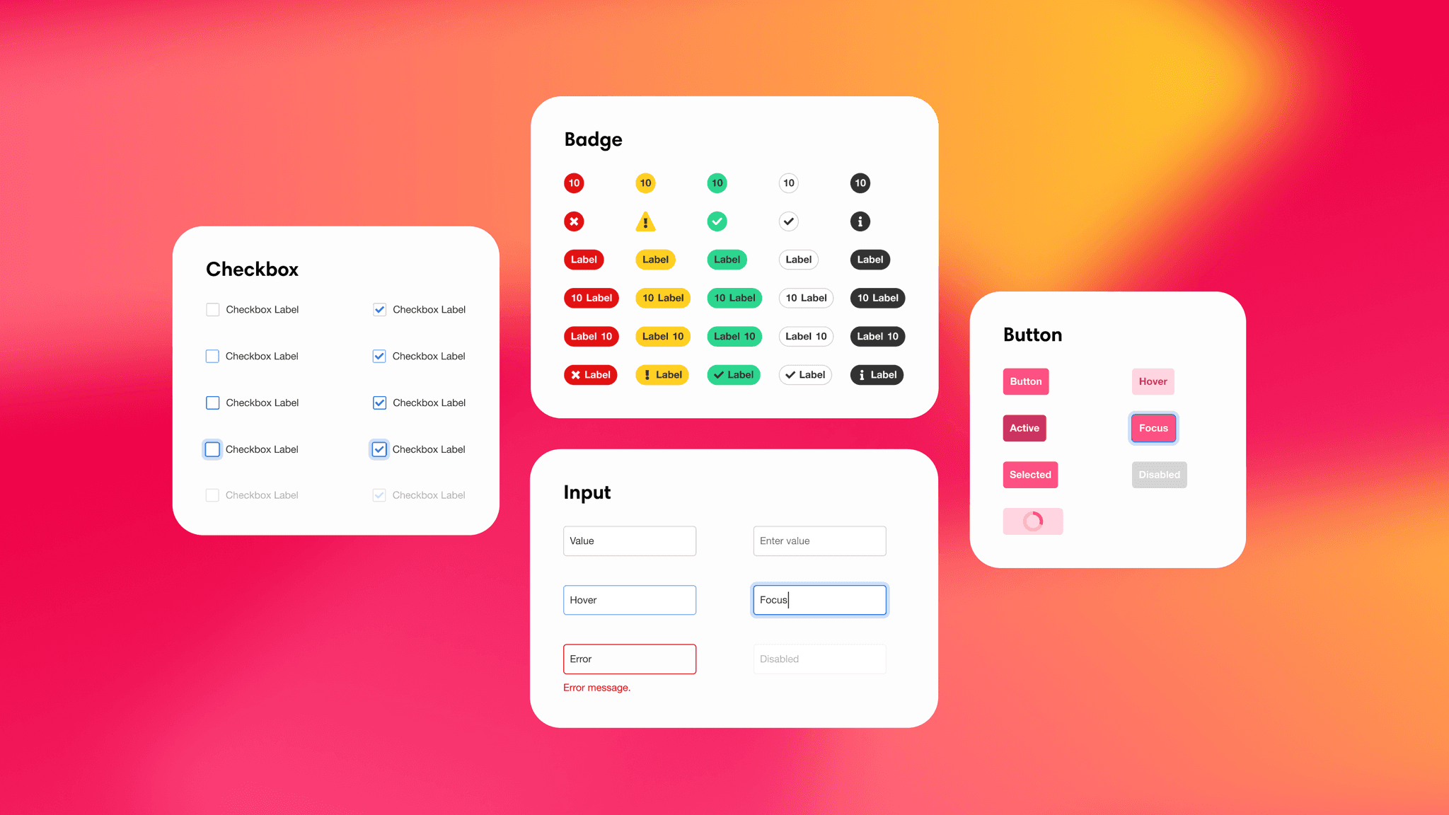
I created the first version of our library based on our component specs. The library was accessible from a master “Component Library” file within our Figma team. Component variations and states appeared as a separate elements that our team can pull from in the Figma Assets panel.

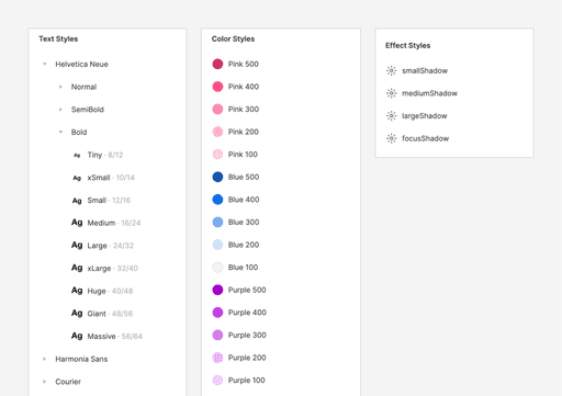
Each component and their variations utilize our design tokens to an atomic level.
Design
Present
Scale
Get buy-in from the team
A challenge with design systems is maintaining consistent adoption and securing continued team support over time. As new people join the team, I needed to show why having consistent design resources would help our team as we grow. Here’s how I presented my case:
Problem
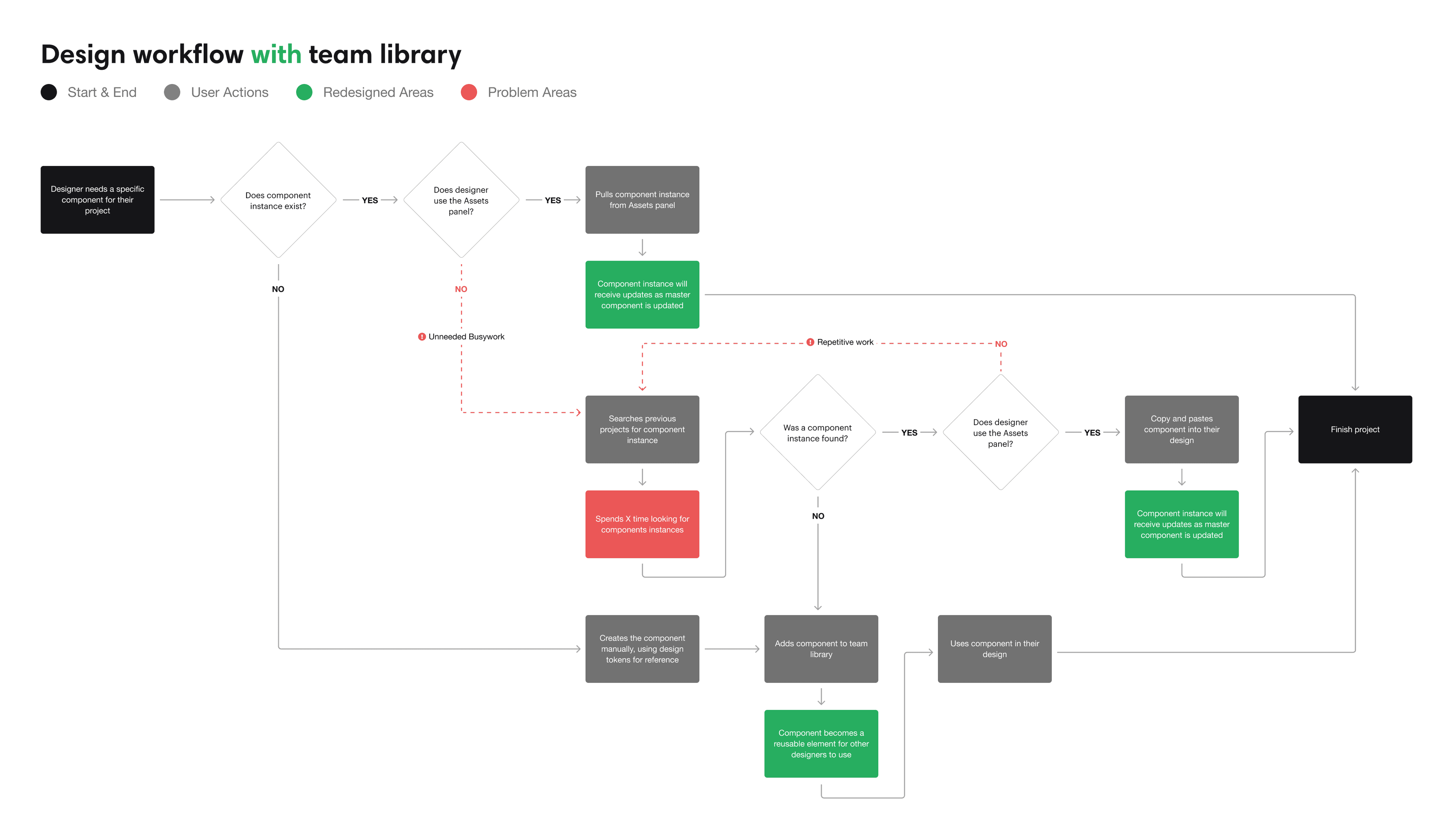
Our current workflow was time-consuming and created inconsistencies
Designers were either recreating their own component instances or copy and pasting from existing designs. This lead to inconsistent and outdated work as specs were updated.
Opportunity
Help designers be consistent
A shared library can uphold consistency while enabling more incremental design updates. Designers can use the library to compose UI that are consistent across projects, but meet different use cases.
Problem
Updating designs requires significant manual effort
Using outdated work led to even more inconsistent and outdated work. Designers were spending a significant as much a week or more reviewing and updating their designs.

Opportunity
Create opportunities to improve reusability and apply incremental updates
A shared library means more opportunities to improve our design workflow, with design work remaining current and reusable. This allows us to implement updates more granularly and gradually.
Opportunity
Enable our team to collaborate and contribute more iteratively
As the Airkit Design System evolves, we'll need a flexible process to change things as needed. A shared library enables our team to participate and contribute to discussions that'll be passed down as new iterations down the road.
Opportunity
Enable our team to design without relying on design support
Design teams are usually smaller in comparison to other teams, especially at startups like Airkit. Additionally, several team members have expressed interest in design, but they didn't know where to start.
A shared library enables both new and existing team members to collaborate within our system independently, reducing the need to have designer by their side.

Engineering and design working together, creating more opportunities for ideation and collaboration.
Design and Engineering working together, creating more opportunities for ideation and collaboration.
Results
Increased availability for our team
Once our component library was published, it became the definitive source for our designers. Centralizing it in Figma helped us maintain consistency across different projects.
Faster design turnaround
Our timelines for high-fidelity visual design were significantly reduced, going from 1-2 weeks down to just 2-3 days. Designers were spending less time starting from scratch and more on time iterating.
Increased iterative contributions
Increased access also enabled our team to make contributions more iteratively and publish changes more rapidly to meet our team’s growing needs.
Design
Present
Scale
Scale our design system in Figma
There was still a need to continue scaling our system and make it more accessible to our team. I continued to help maintain our design system, addressing issues and integrating Figma's latest features along the way.
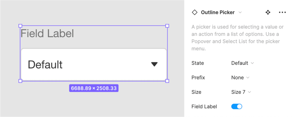
Incorporate design tokens
Using Figma styles, I updated our components to use reusable design tokens, allowing them stay updated at a more atomic level.
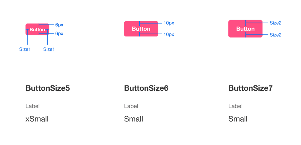
Adding sizes and other properties
I added sizes and other properties so that designers can grab components that more closely resemble engineering's implementation in Storybook.
Incorporate native Figma features
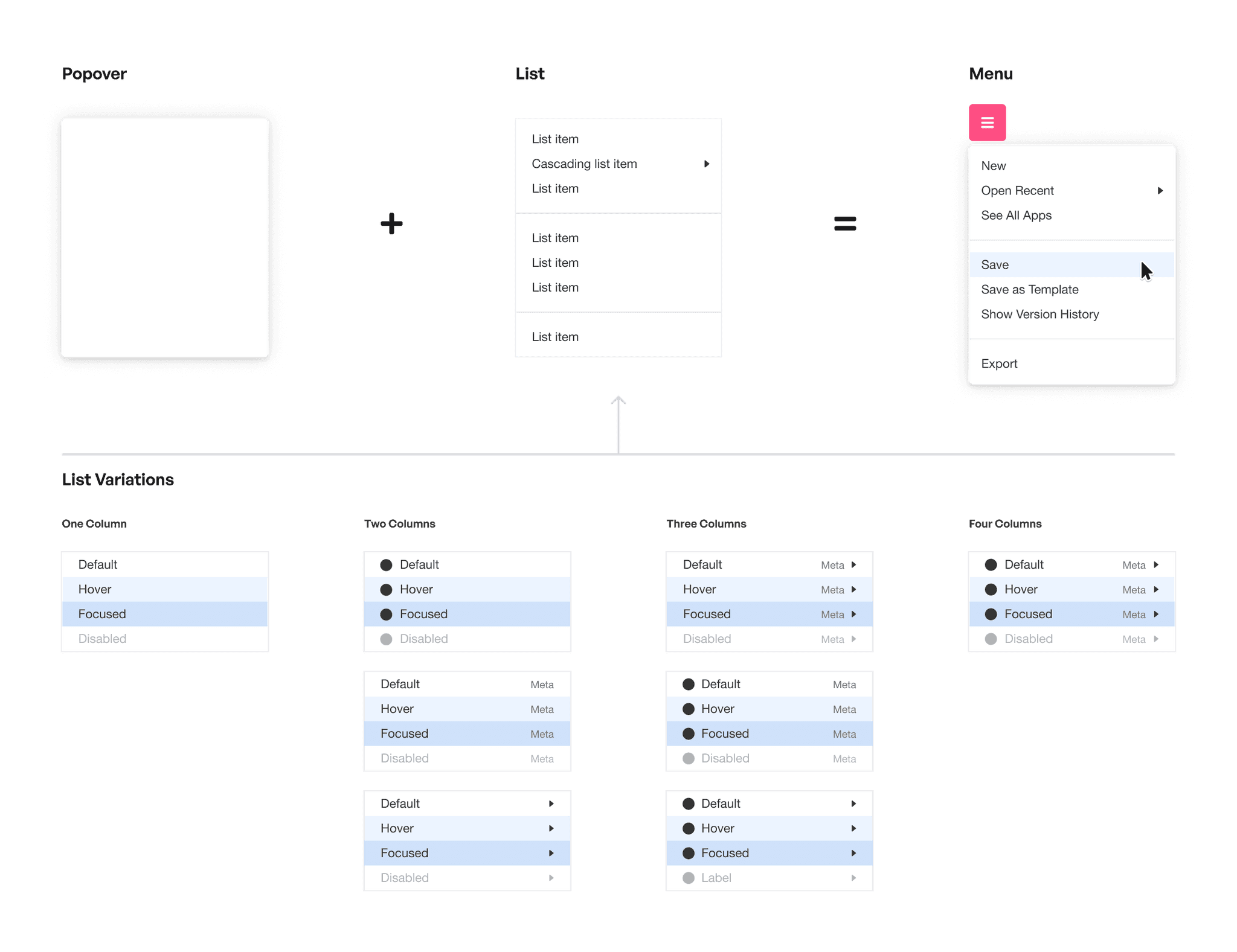
To further optimize usage of our design system, I rebuilt our components to utilize native Figma features (e.g., Auto Layouts and Variants).
Adding documentation
I worked with the Design team to write documentation, providing clear guidelines on component usage for anyone working in our system to use.