AIRKIT
Improving Layouts
in Airkit Studio
ROLE
Product Designer
Duration
March – April 2021 (1mo)
TEAM
Head of Design
SDE Manager
SDE
Tools
Figma
UserTesting
Responsibilities
UX Research (User Interview, Research Analysis)
Product Design (Concepting, Prototyping, Usability Testing)
Background
In Dec 2020, I designed Version 2 of Layouts to enable users to configure more dynamic app layouts within Airkit Studio. Most users—developers who may not be familiar with frontend coding—can build a simple web page with headlines and inputs in ~30 minutes. Version 1 was built by Engineering without design support, resulting in a simpler UI that took most users ~10 clicks to configure but required CSS knowledge on FlexBox.
We launched in Feb 2021 and saw the overall time users were spending building apps improve by 5 minutes, yet the number of clicks doubled.
Version 1
Featuring a simpler UI, this version required users to understand CSS Flexbox concepts to configure.
Version 2
This version introduced features to move away from Flexbox towards a more interactive UI.
How might we empower users in a way they can understand Layouts, while making it simple and uncomplicated to use?
Goal
Address the new pain points to reduce the time developers spend configuring layout and improve their understanding and confidence in using Layouts.
Process
I began by gaining and understanding insights into the issues to make more informed decisions during our discussions. The plan was to:
Research
Collect & analyze feedback from users
Identify problem areas through empathy.
Ideation
Collaborate with Engineering
Design and develop our solutions.
Test
Conduct user testing
Test and validate our solutions.
Research
Ideation
Test
Collect & analyze feedback from users
To understand our users' issues, I worked with the team to collect feedback. Their insight revealed that the new UI was still missing their expectations, creating more confusion, manual work, and guesswork.
Scott A.
Solutions Engineer
Jeff C.
Solutions Consultant
Zack C.
Developer Advocate
I grouped the feedback into key problem areas that we could tackle within this sprint.
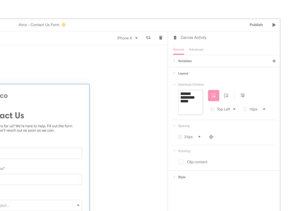
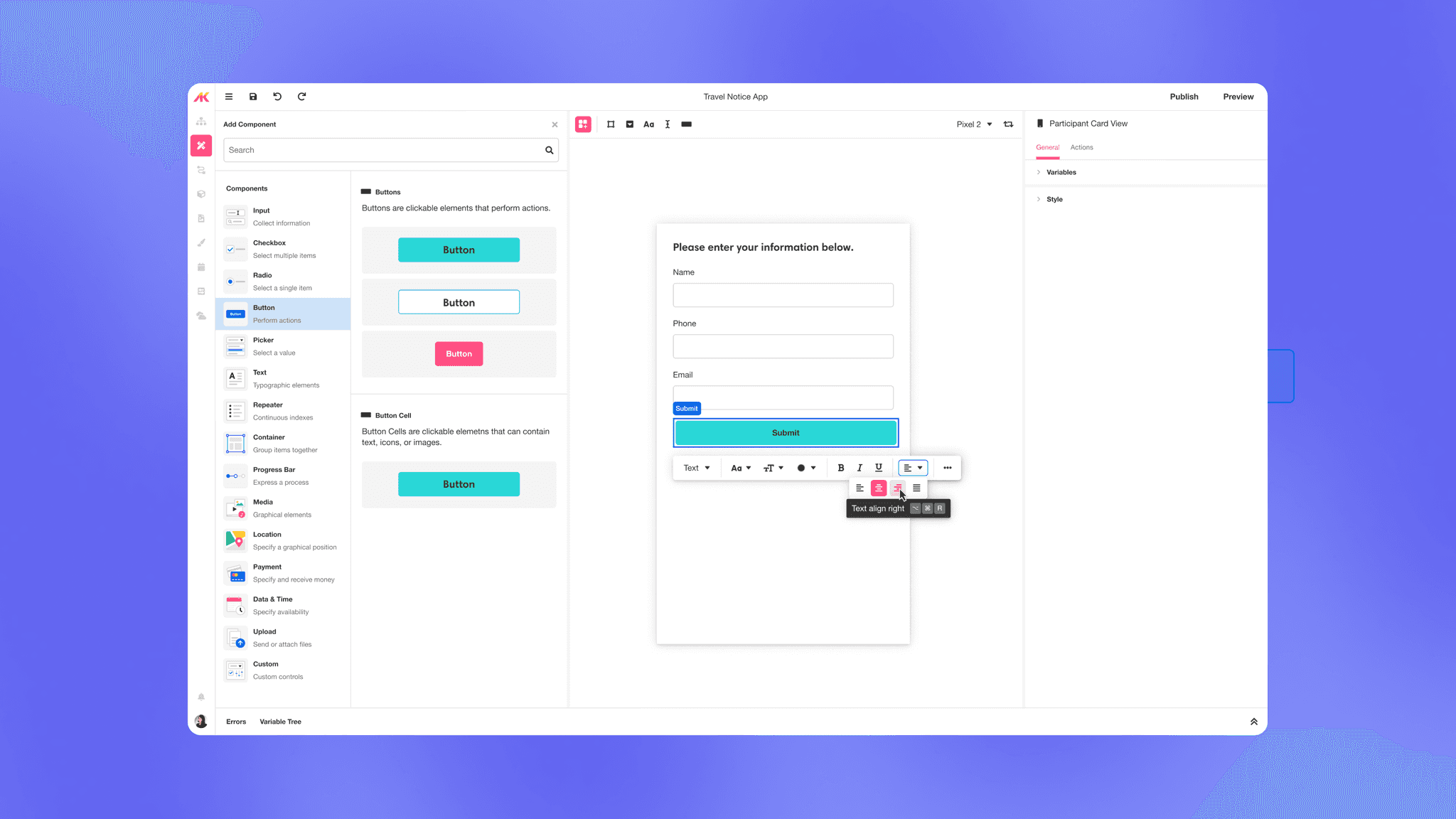
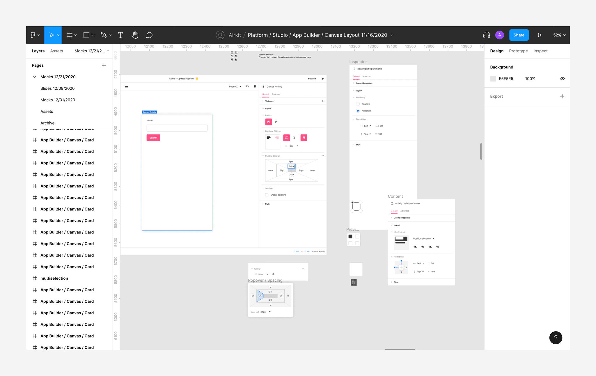
Layout Preview
Shows a static visual preview of how UI elements in the layout are aligned within a parent Container. Users kept clicking on the visual expecting something to happen.
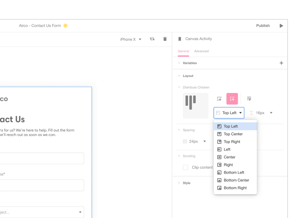
Alignment Property
Sets how UI elements are aligned within a parent Container. Users didn't understand the alignment options and would go through each option until they found the one they needed.
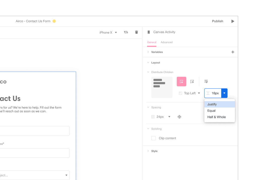
Distribution Property
Sets how UI elements are spaced apart from each other. Users didn't know they can enter numeric values to set fixed spacing, believing there were only certain options they can choose from.
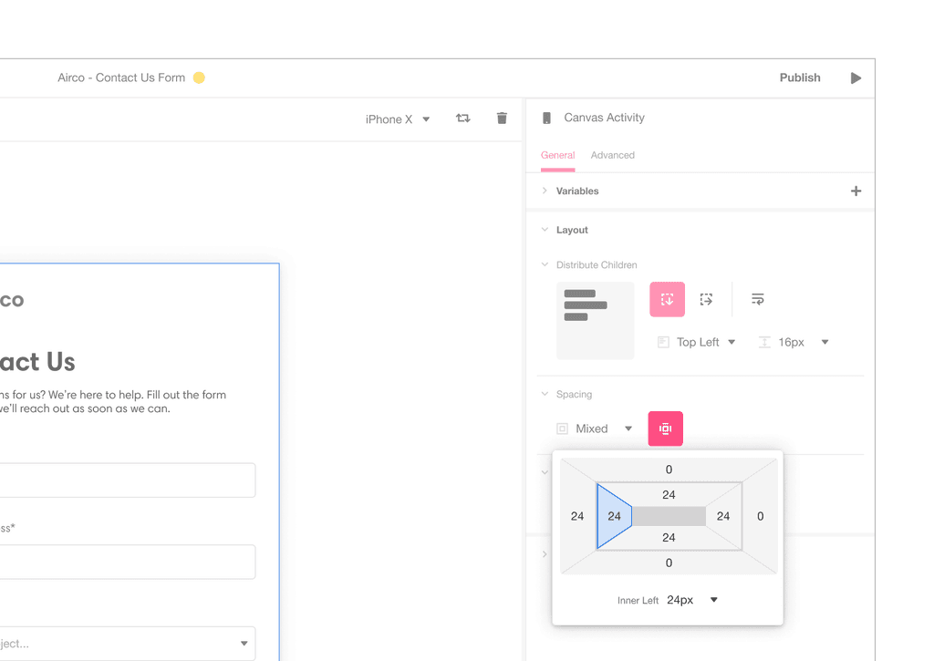
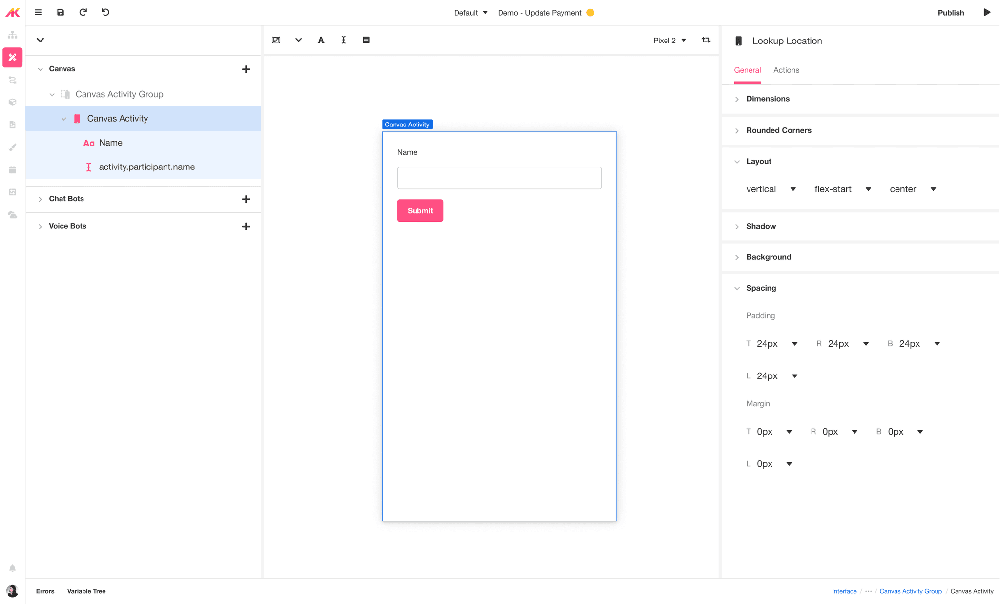
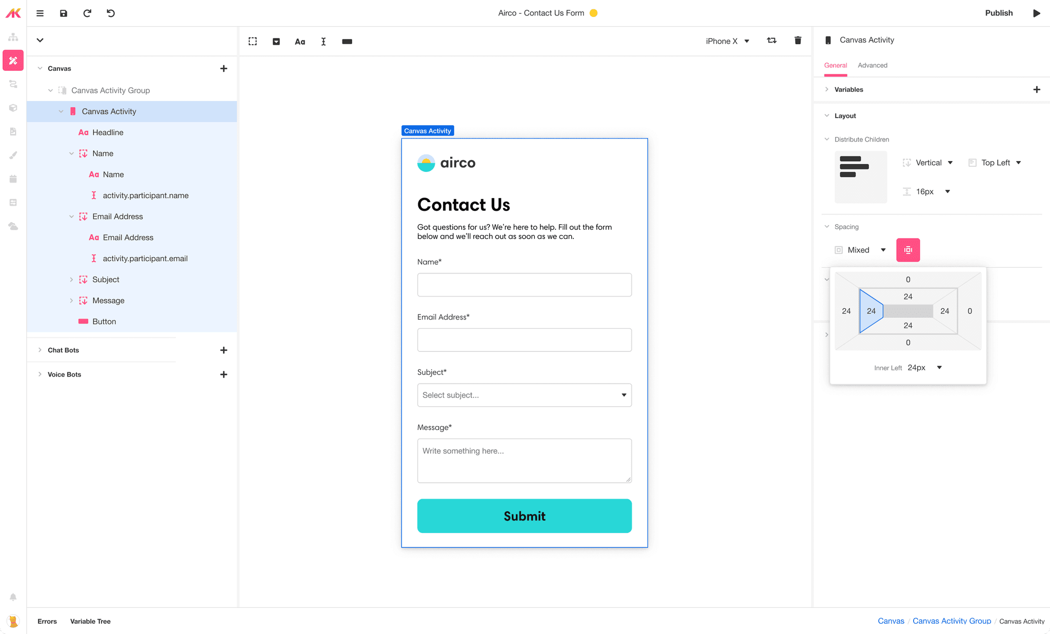
Padding & Margin
These properties specify the spacing around a UI element. Margin and padding properties were hidden behind a button click, which most users didn't find.
Research
Ideation
Test
Collaborate with Engineering
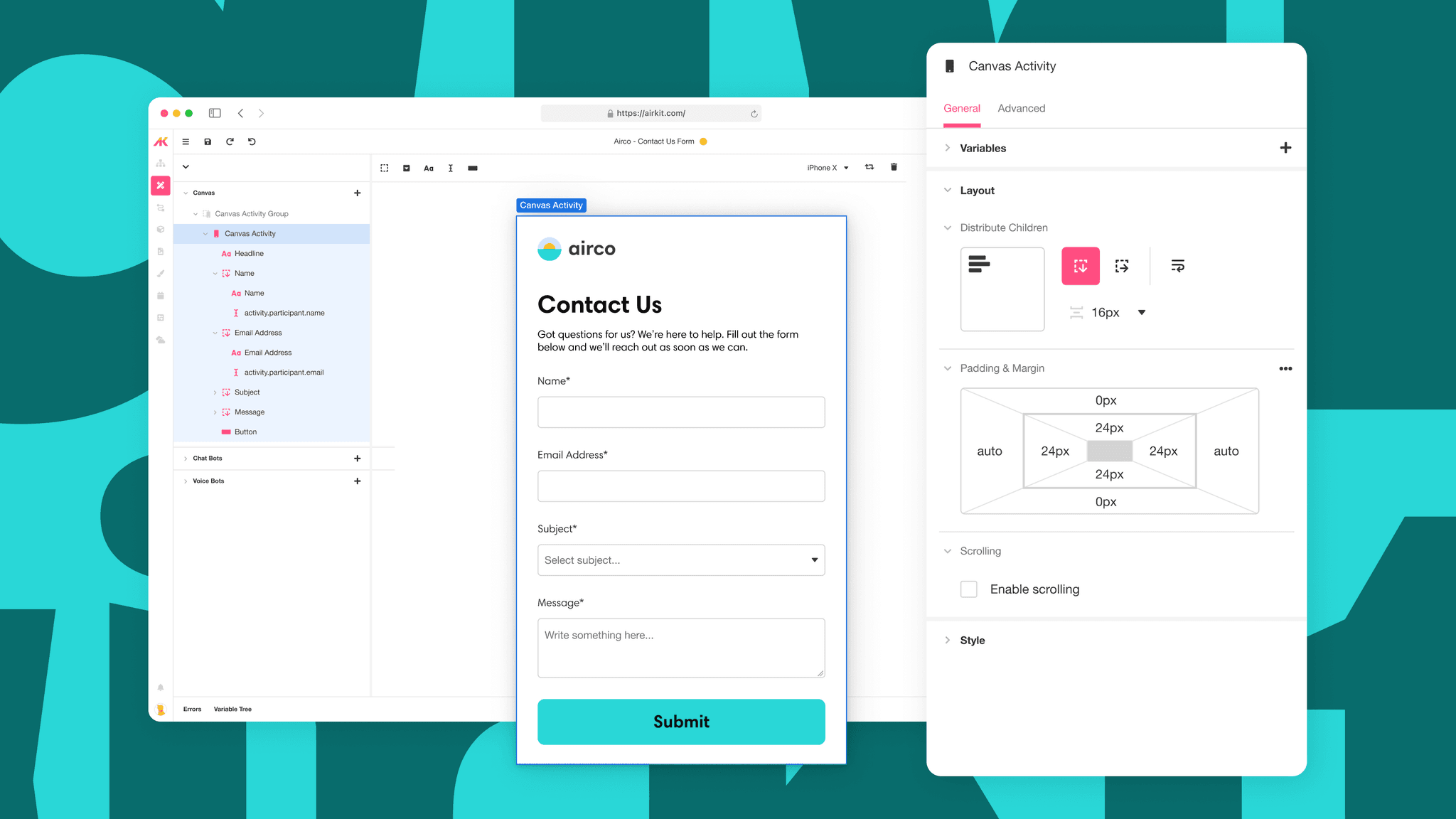
I conducted a collaborative session in Figma with Engineering, spending a few hours discussing potential solutions. I helped mock our solutions throughout the discussions and again when we built the solutions for user testing.
Our co-working session in Figma after a productive day of ideation.
Solution 1
Make the layout preview interactive
Problem
Users were confused by the alignment options and the visual shown and weren't making the connection between the two.
They expected the visual to be interactive in a way but it wasn’t, or
They were given so many alignment options that they didn’t know what each one did and which one was the one they needed.

Solution
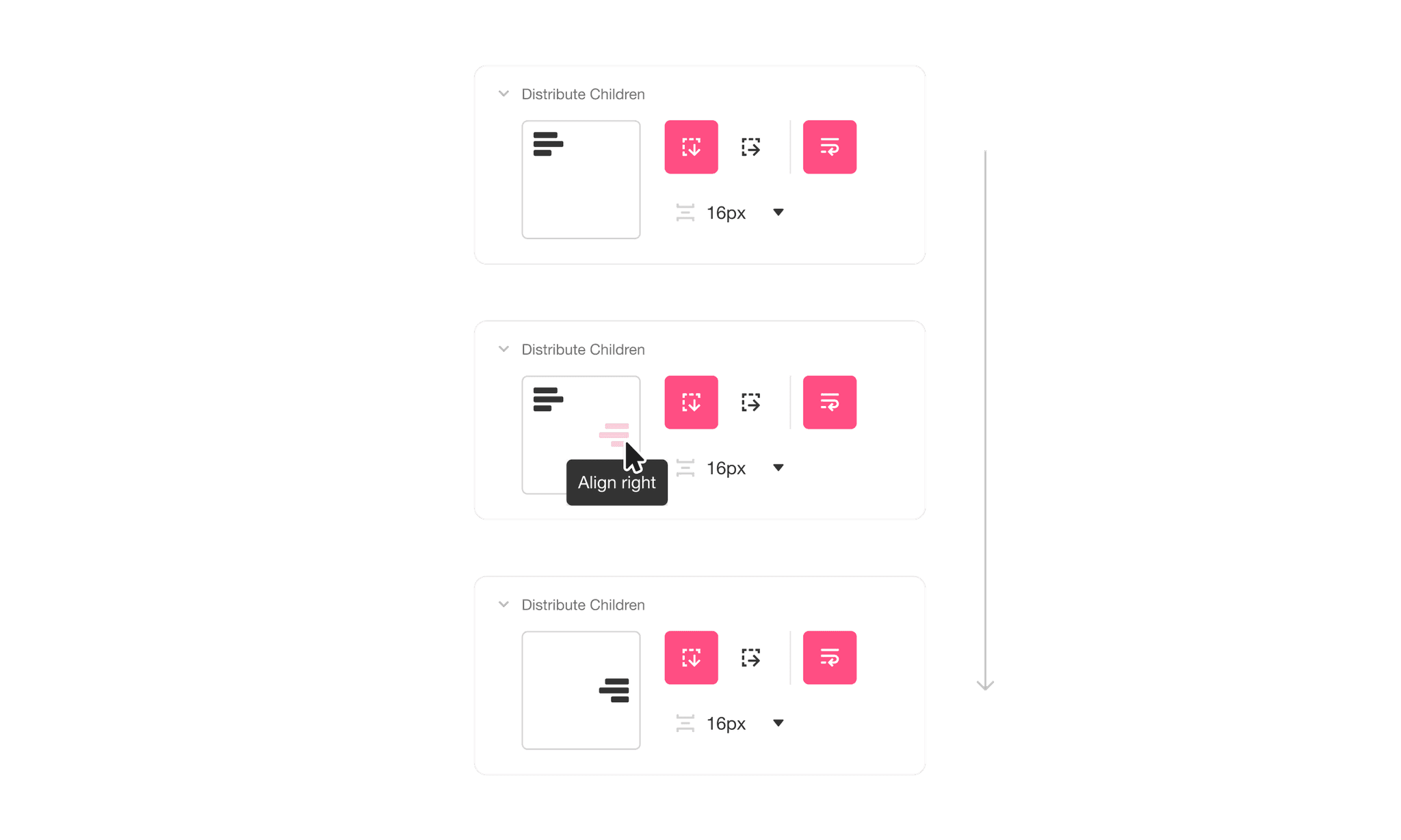
Since the Alignment property and the Layout Preview are closely related, we tackled these two together.
Making the Layout Preview interactive helps reduce redundancy and eliminates the need to have a control for alignment.
This provides users with more proactive and instant feedback when configuring alignment. Users are more likely to learn how each alignment option works through visual and interactive repetition.
Solution 2
Add selectable values to the distribution property
Problem
Users didn’t know that they could specify a fixed amount of distribution spacing because the dropdown options showed three options specific to Flexbox.
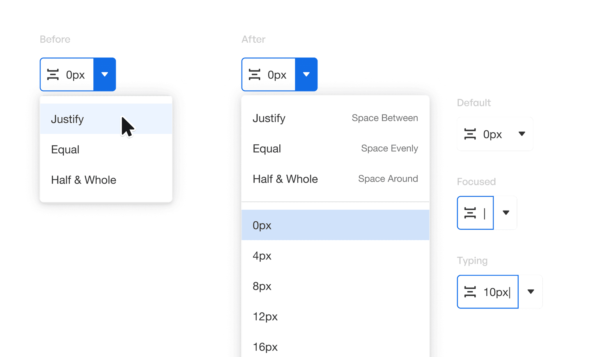
Solution
Adding fixed value inputs into the dropdown list reinforces the idea that these values are accepted inputs, increasing the likelihood of them entering a number. Defining these values would also:
Encourage use of more consistent UI spacing in their app, and
Allow them to tweak values quickly when something more custom is needed.
Solution 3
Bring out the padding and margin properties
Problem
Users didn't know they could adjust padding and margins since these controls were hidden in the UI and only discovered after pressing a button.
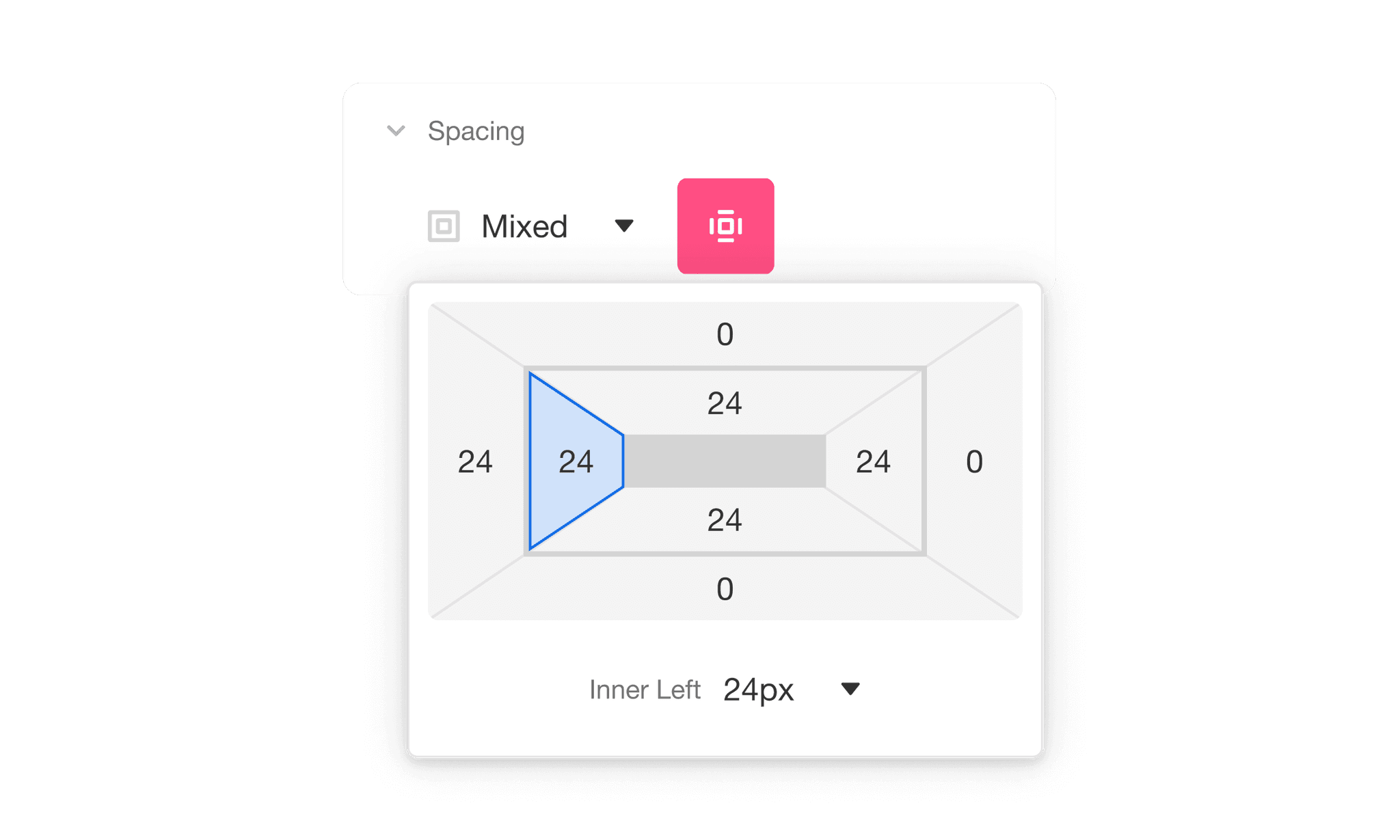
Solution
We fixed this by bringing the box model out of the popup and allowing users to directly edit the two from it. This increases awareness of these two properties and makes it easier to understand how they work together.

Research
Ideation
Test
Conduct user testing
Using UserTesting, I conducted a test with 10 participants who were tasked with building a simple web app.
Compared to the previous iteration, our new solutions were getting much more positive reactions. What we found was that:
Time to complete task

Completed the task under 20 minutes. 30% completed under 17 minutes.
Applying Alignment
To configure layout positions
Applying Padding & Margin
Configured both successfully on first time viewing new box model
Applying Distribution
🤔
Still feeling confused
Participants were still confused by FlexBox concepts that we decided to keep. However, everyone was able to select and enter a value to specify the distribution.
Outcomes
I collaborated with our team and our users to understand the issues they were facing.
Fewer clicks, fewer guesses
A decrease in number of clicks meant that users were making fewer guesses overall.
Users configuring layouts faster
We saw more users were completing similar tasks faster than both Version 1 and Version 2.
More confidence using layouts
Users were finding the new UI easier to use and weren't hesitating looking for properties.
Takeaways
If I had more time…
I would conduct more user testing and design iterations, because these lead to more user-centered outcomes.
I would add ways for users to learn the Airkit platform while building so that we can continue to educate our users and make them more self-sufficient.
What I've learned…
When we’re at differing opinions, open communication can resolve a lot of issues and lead to healthier discussions and better results. I believe it strengthens our teamwork and helps us progress more effectively.