AIRKIT
ROLE
Product Designer
Duration
Q2 2021 (24h)
TEAM
SDE Manager
SDE
Tools
Figma
Responsibilities
Product Design (Concepting, Prototyping)
Background
Airkit regularly held hackathons every quarter so the team has a chance to experiment fast and explore beyond regular work. For this hackathon, our team imagined how we can bring more powerful WYSIWYG features to Airkit Studio to make it a "full-fledged" design tool. Airkit Studio's App Builder relied on the Tree to manage component layout hierarchy, and the Inspector to style components. Users have cited the missed expectations and opportunities in a non-interactive app building experience.
To fix this, we wanted to build more interactive and contextual features that empower users to design their app more intuitively and efficiently.
Goal
Design WYSIWYG features that provide users with a more interactive app building experience, so that we can reduce the gap between design and implementation, and accelerate the app building workflow.
Process
I needed to collaborate with our team and our users to understand the issues they were facing.
Research
Conduct comparative analysis of WYSIWYG experiences
Identify problem areas through empathy.
Ideation
Collaborate with Engineering
Work together to ideate on WYSIWYG solutions that we can build in 24 hours.
Research
Design
Conduct comparative analysis of WYSIWYG features
After working on Airkit Studio for two years, we already had a general idea of what we wanted to explore. We didn't want to limit our imagination to what we know, so I worked on a comparative analysis of design and app building tools that we can take inspiration from.
Unsurprisingly, our excitement got the better of us and so we challenged ourselves to tackle the following features:
Inline Text Editing
Problem
Users can only edit text content from the Inspector. Text editing also do not support shortcuts.
Solution
Let users edit text from the canvas, so that they can do basic text editing without having to navigate the Inspector properties.
Drag & Drop
Problem
Users can only add and rearrange components from the tree, which has often been cited as difficult to navigate.
Solution
Let users add and rearrange components, so that they have full control over the layout without navigating the tree.
Component Affordances
Problem
Users must use the Inspector to modify component properties such as size, corner radius, and padding/margins.
Solution
Incorporate component affordances directly on the canvas, allowing users to modify attributes without resorting to the Inspector.
Contextual Editing
Problem
Users must rely on and navigate the Inspector in order to apply and modify component styles.
Solution
Show a contextual editing tools when a component is selected, so that users edit common style properties without needing to navigate the Inspector.
Inline Text Editing
Problem
Users must navigate the tree to rearrange the order of components or delete a component.
Solution
Enable keyboard shortcuts for reordering and deleting components, so that users can perform these actions without needing to navigate the tree.
Research
Design
Collaborate, design, and build
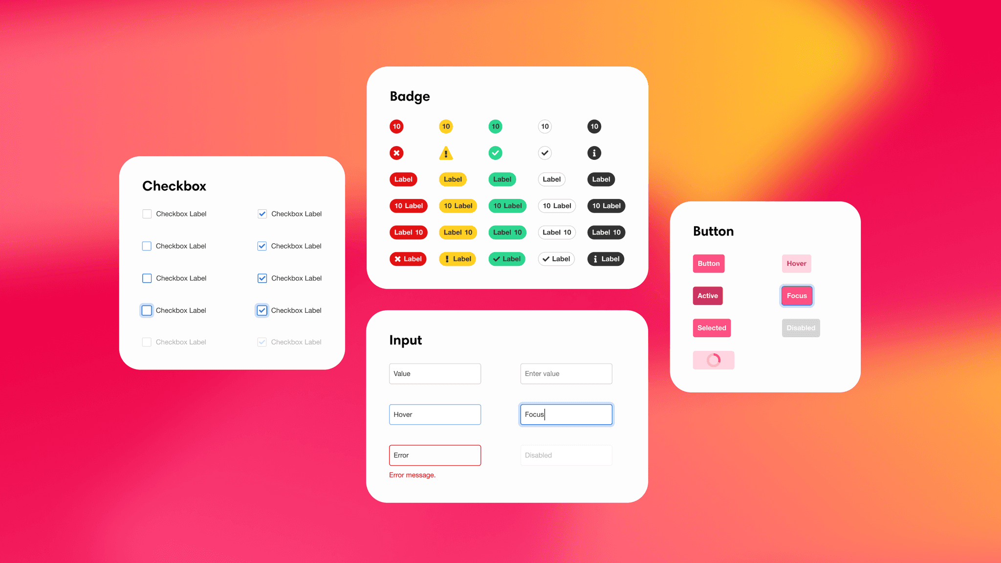
Once we agreed on the features we wanted to build, we spent some time in Figma to conceptualize the ideas. As discussions went on, I mocked out the experiences and adjusted based on their feedback.
Feature
The Component Drawer
The Component Drawer allows users to quickly search through components they available to add to their app. Users can click and drag components from the drawer and drop them into their app to add.

01
Component Drawer
The Component Drawer allows users to quickly search and add components directly to their app.

02
Adding a component
To add a component, users need only click and drag the component to the canvas.

03
Dropping in the layout
Dragging a component over the canvas shows a drop indicator to indicate to users where the component will be added.

04
Dropping into containers
Users can easily add components into Containers that contain other components.
Feature
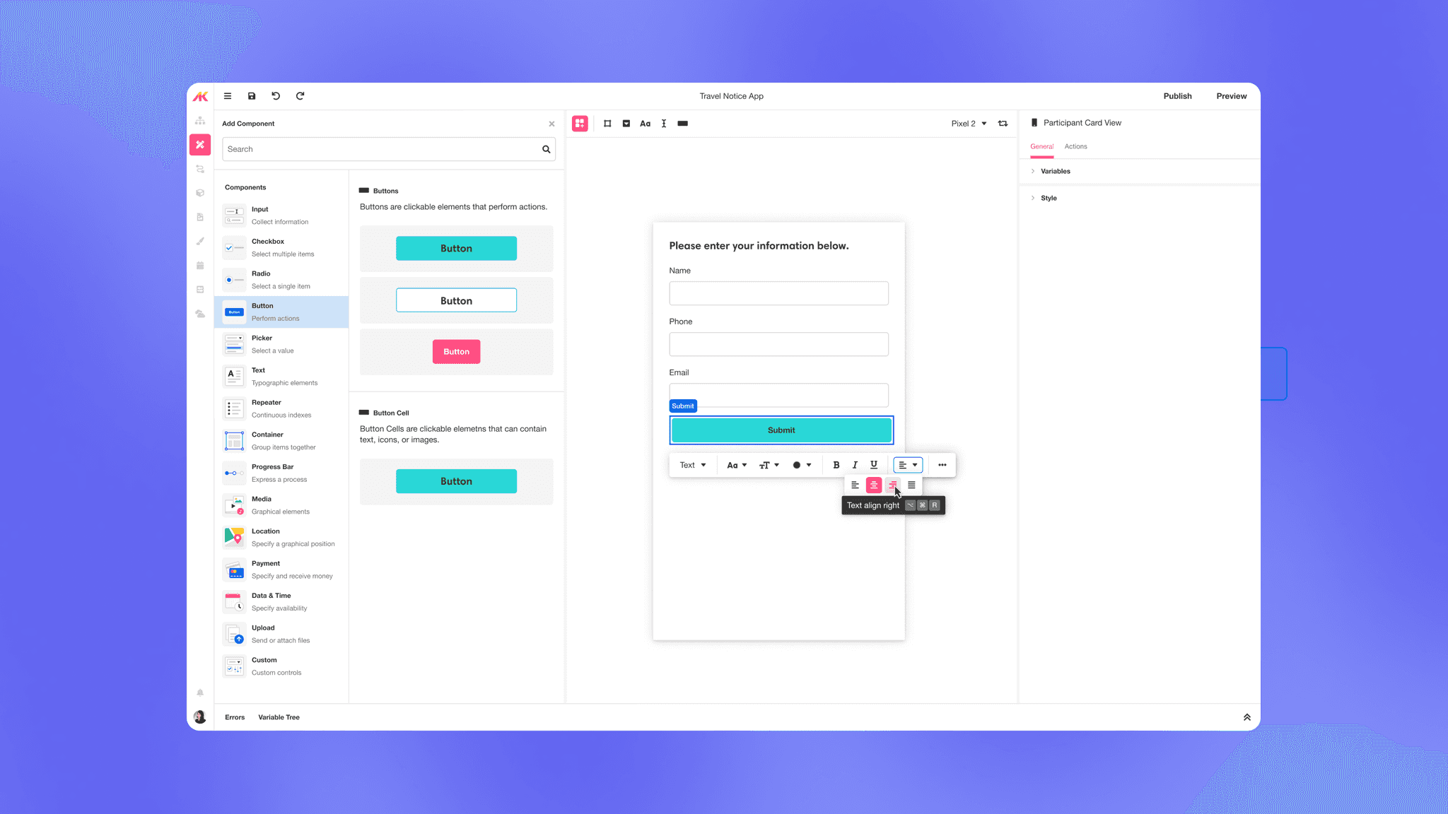
Rearranging Components
Users can now see affordances in the canvas that when selected, allow them to rearrange components when selected and dragged.
01
Handles
Hovering over the canvas reveals handles that users can grab.

02
Drag to rearrange
Pressing and holding onto the component allows the user to move it out of place. A bordered area is used to indicate its current position.

03
Rearranging components
Dragging the component in specific directions will move the bordered area to indicate its new position.

04
Drop to rearrange
Releasing the mouse commits the component to the new position.
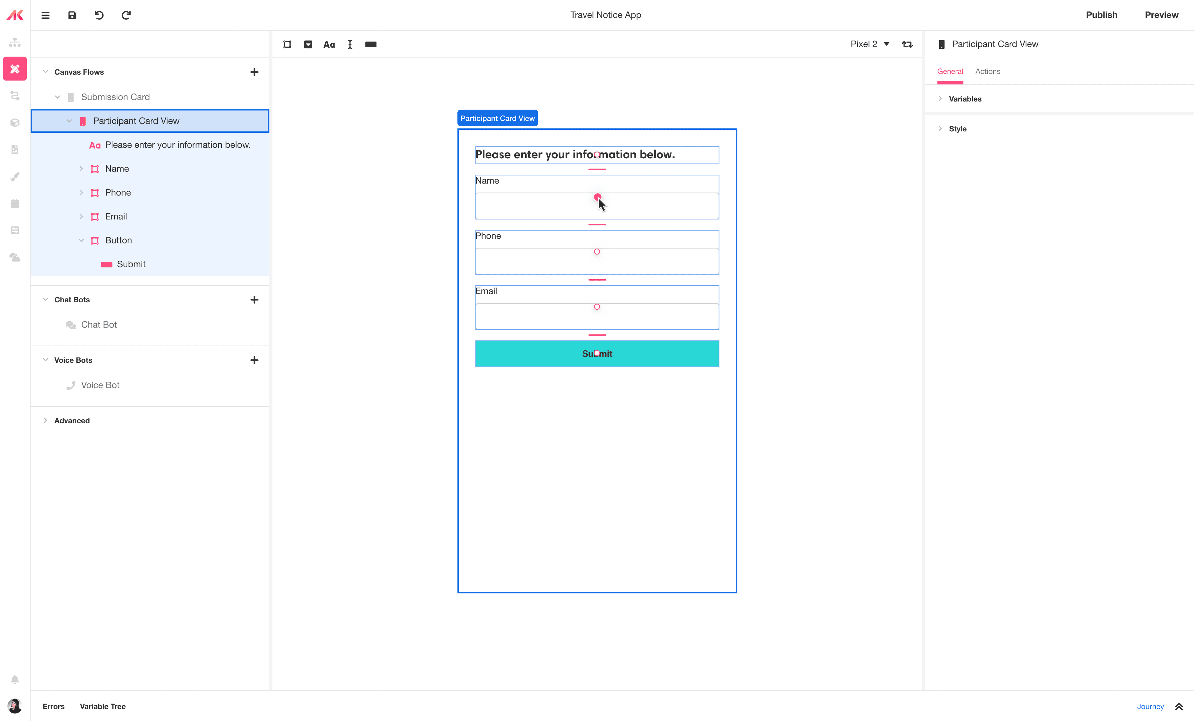
Feature
Component Affordances
The canvas now shows multiple affordances depending on the component selected. Users can now modify the space between components and adjust the corner radius and size of a component.
Adjusting Spacing between UI Elements

01
Spacing handles
Users can select handles between elements within the same container to adjust the spacing between.

02
Drag to adjust spacing
Dragging a handle within a flex container will highlight and adjust all the spacing consistently between elements.
Adjusting Corner Radius

01
Corner handles
Users can select handles on specific components to adjust their corner radius.

02
Drag to adjust corner radius
Dragging the handle will adjust the corner radiuses of each corner.
Adjust Width & Height

01
Size handles
Users can select handles on specific components to adjust theor width and height.
02
Drag to adjust width and height
Depending on where the user is grabbing, they can adjust the width, height, or both.
Feature
Contextual Toolbar
The Contextual Toolbar enables users to adjust common settings based on the selected component. The toolbar shows commonly adjusted properties, without the need to search through the Inspector.

01
Contextual toolbar
Selecting certain components will surface a toolbar with common style properties that users can modify without looking to the Inspector.

02
Contextual options
The toolbar properties change based on the component selected.

Feature
Keyboard Shortcuts
We added keyboard shortcuts so that users can quickly rearrange or delete components after selecting them on the canvas. Users won't need to search through the tree in order to find the component they want to adjust.

Results
We were able to successfully implement 80% of the designs and delivered a presentation at the end of the hackathon to the team. We ended up take home 1st Place!
Some key takeaways from this hackathons were that:
🤝
The best designs come from collaboration
It was inspiring to see how each member of our team was able to bring to the table a different idea and perspective.
💭
Think big to inspire others
We really wanted to think big and inspire others to feel the same. We were able to inspire others to continue our work in other forms and projects.

(Above) We wanted to surprise everyone with our project. Hence, explosions 💥.